Enterprise Platform
Zero to Market-Ready Enterprise Infrastructure
01
The Problem
A small team had been building custom ordering solutions for enterprise clients. One-off engagements. Bespoke builds. They'd proven they could deliver — but they couldn't scale because they didn't have a product.
What existed when I arrived:
A collection of technical capabilities (ordering, menu management, analytics, integrations)
A handful of successful client implementations
No unified identity. No positioning. No brand. No messaging.
The gap wasn't technical. It was strategic.
Enterprise software doesn't sell because it exists. It sells because it's legible, defensible, and packaged in a way that makes procurement say yes. None of that infrastructure was in place.
They needed to go from "we can build this" to "we can sell this" — and they needed it fast.
Proven capabilities. No productized offering.
02
The Engagement
This wasn't a design project. It was a go-to-market build that happened to include design.
I was brought in to do everything required to make this thing sellable to enterprise buyers:
Positioning, competitive framing, target customer definition
Name usage, visual identity, tone of voice, language rules
Page-by-page content specs, stakeholder-specific narratives
Site structure, content hierarchy, user flows
Full marketing site, interactive discovery deck
Built and deployed everything
This is work that typically spans multiple agencies (strategy, brand, copy, dev) and takes 4-6 months. I delivered it in approximately 6 weeks, solo.
03
Strategic Foundation
3.1 Positioning: What Is This Thing?
Before designing anything, I had to answer the fundamental question: what is this platform, and what is it not?
This isn't a product. It's infrastructure.
It runs behind ordering experiences, not in front of them. It's closer to Stripe or Twilio than to typical SaaS platforms. This distinction changes everything about how you talk about it.
- →"Sign up and use our system"
- →Feature lists
- →Templates and constraints
- →Vendor relationship
- →Recurring fees that compound
- →"We power your system"
- →Capability unlocking
- →Flexibility and control
- →Technology partnership
- →Investment that pays down
I codified this into a Brand Constitution — a governing document that defines positioning, voice, language rules, competitive framing, and CTA conventions. This ensures anyone writing for the brand stays on-message without needing me involved.
[Platform] is not a traditional software product.[Platform] is infrastructure.At its core, [Platform] is:- An **ordering engine**- An **operational layer**- A **system that runs behind restaurant experiences**- An **intelligence-augmented foundation** for digital ordering[Platform] powers experiences rather than replacing them.It sits beneath front-end applications, POS systems, and workflows.
3.2 Competitive Framing
Enterprise buyers always ask: "Why not just use [competitor]?" I needed a clear, defensible answer.
UI-first
Pre-built experience with customization. You rent space on their system. They own the customer relationship, data, and roadmap.
Engine-first
Runs behind your experience. Keep your POS, front-end, brand. Handles operational logic as infrastructure you control.
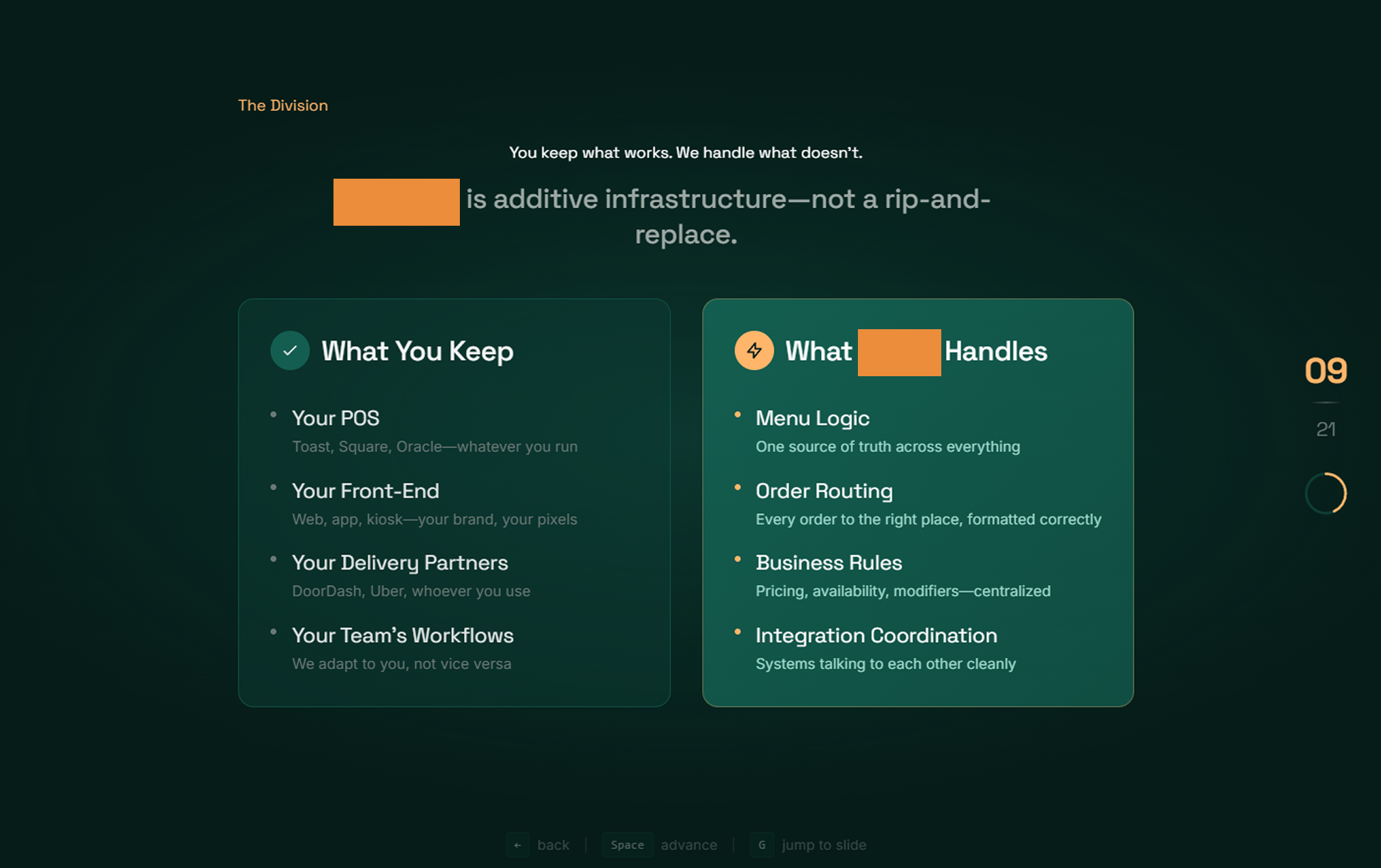
3.3 The Two-Product Architecture
The platform isn't one thing — it's two complementary layers:
Core — Operational Layer
- • Runs ordering logic
- • Unifies workflows
- • Enforces consistency
- • Handles routing, pricing, throttling
- • Single backbone for all systems
AI — Intelligence Layer
- • Interprets operational signals
- • Assists decision-making
- • Adapts system behavior
- • Surfaces context when needed
- • AI assists, never replaces
04
Messaging Architecture
4.1 Page-by-Page Content Strategy
With positioning locked, I built out the full messaging architecture — not just headlines and body copy, but the complete content spec for every page. This isn't a wireframe with lorem ipsum — it's production-ready messaging.
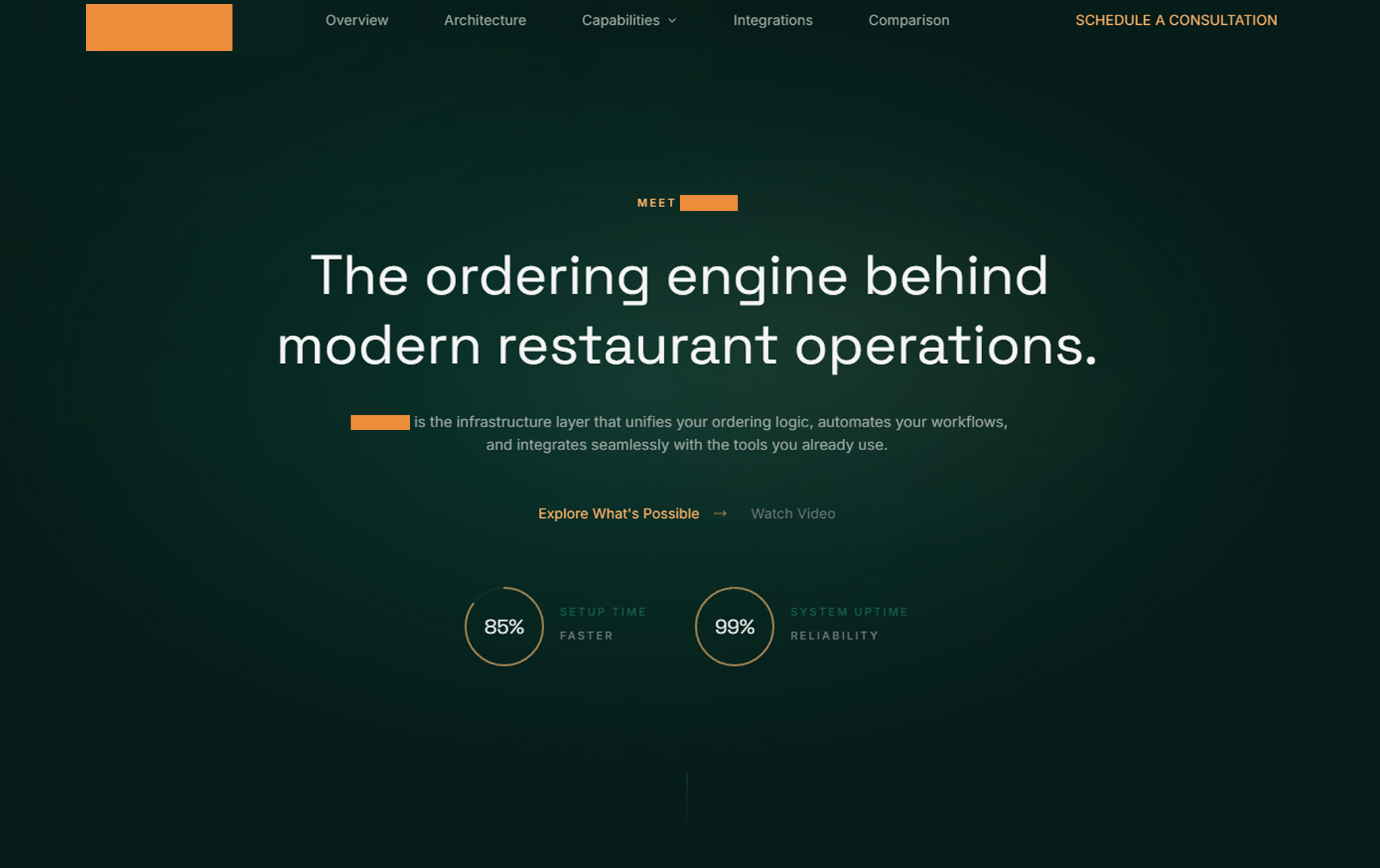
Entry point, establish credibility
"The ordering engine behind modern restaurant operations"
Explain the architecture
"Defined by what it runs, not what it replaces"
Deep dive on what's possible
Six modules: FlowLogic, MenuSync, ShieldGuard, LinkHub, VisionAI, ServeUX
Product page for operational layer
"The backbone of your ordering infrastructure"
Product page for intelligence layer
"Intelligence embedded into how the engine operates"
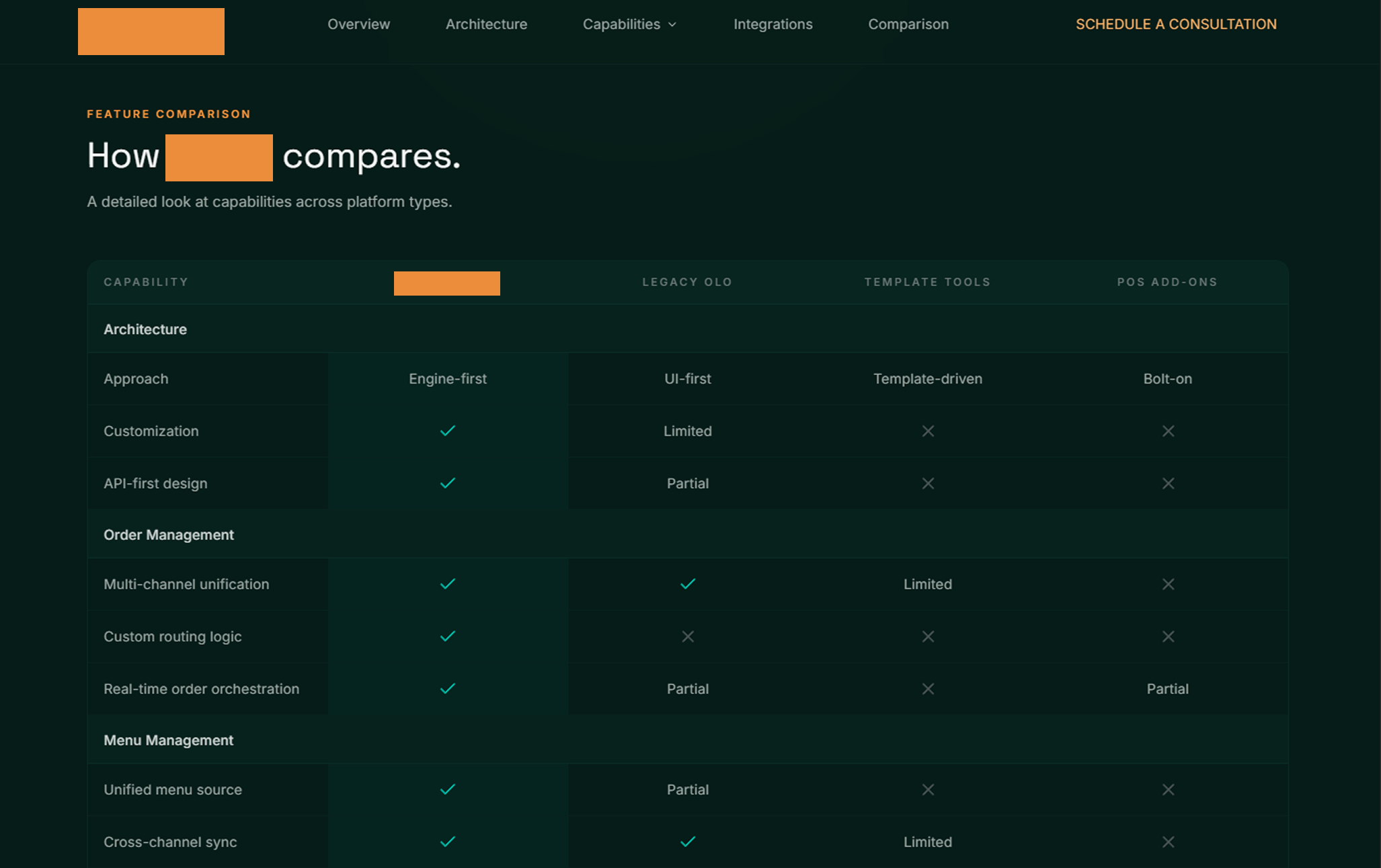
Competitive positioning
"The difference is architectural"
| Page | Purpose | Key Message |
|---|---|---|
| Home | Entry point, establish credibility | "The ordering engine behind modern restaurant operations" |
| How It Works | Explain the architecture | "Defined by what it runs, not what it replaces" |
| Capabilities | Deep dive on what's possible | Six modules: FlowLogic, MenuSync, ShieldGuard, LinkHub, VisionAI, ServeUX |
| Core | Product page for operational layer | "The backbone of your ordering infrastructure" |
| AI | Product page for intelligence layer | "Intelligence embedded into how the engine operates" |
| Comparison | Competitive positioning | "The difference is architectural" |
4.2 Stakeholder-Specific Narratives
Enterprise sales involve multiple stakeholders with different concerns. The messaging architecture includes language for each audience — what to lead with, what objections to anticipate.
Unified control across locations
Integration complexity
Own the stack, no vendor lock-in
Security and compliance
Predictable costs, no fee stacking
ROI timeline
Strategic asset, not just software
"Why not just use [competitor]?"
4.3 The "Capabilities, Not Features" Rule
One of the most important positioning decisions: the platform doesn't have "features." It unlocks "capabilities." This sounds like semantics but it changes how you write everything:
"Platform includes menu management"
"Menus stay synchronized across every channel"
"Features like routing and throttling"
"Enables consistent order routing and intelligent throttling"
"Out-of-the-box integrations"
"Systems connect without disruption"
05
Design & Development
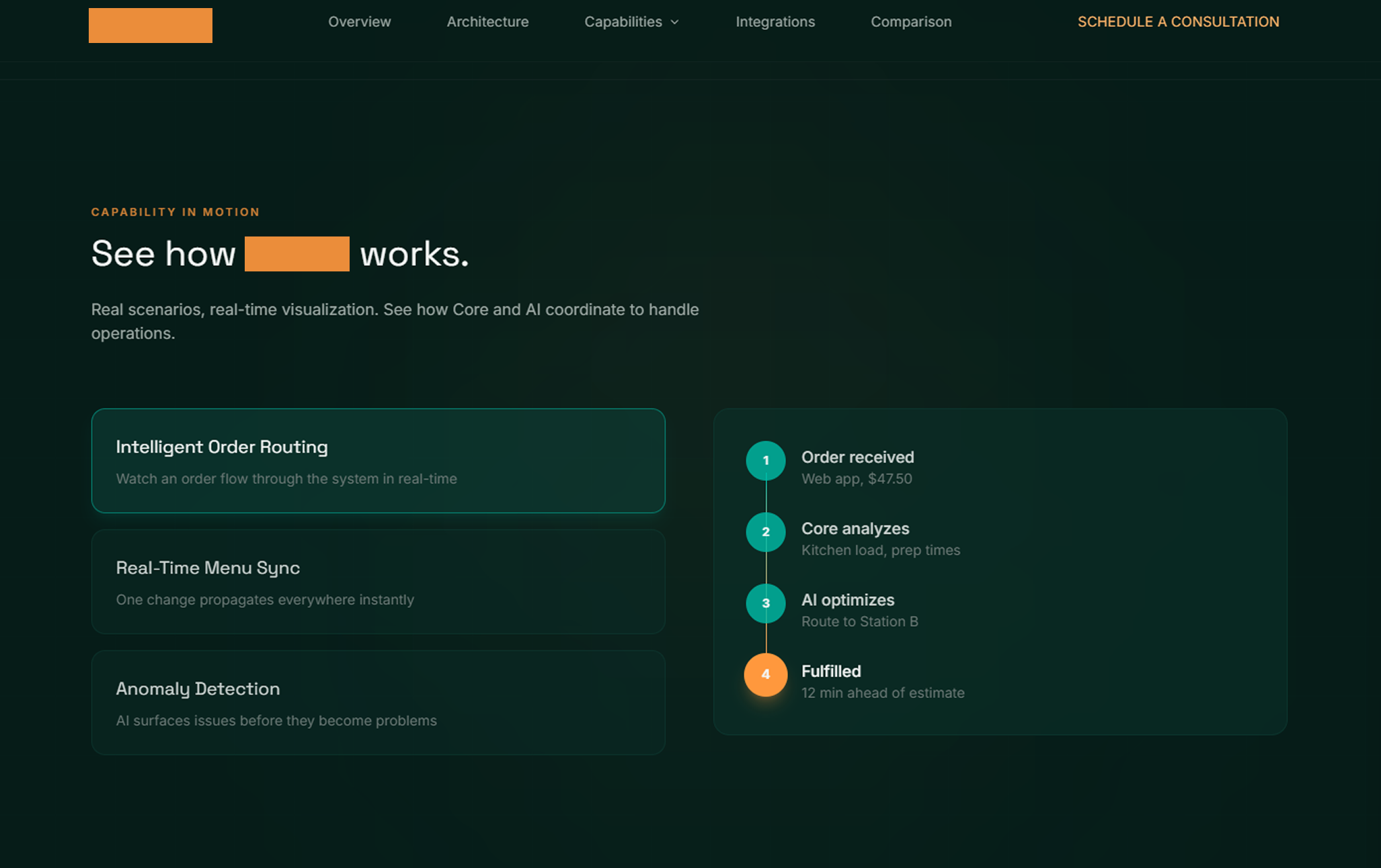
5.1 Marketing Site
With strategy and messaging locked, I designed and built the full marketing site.
Enterprise infrastructure should feel serious. Dark palette conveys technical depth and premium positioning.
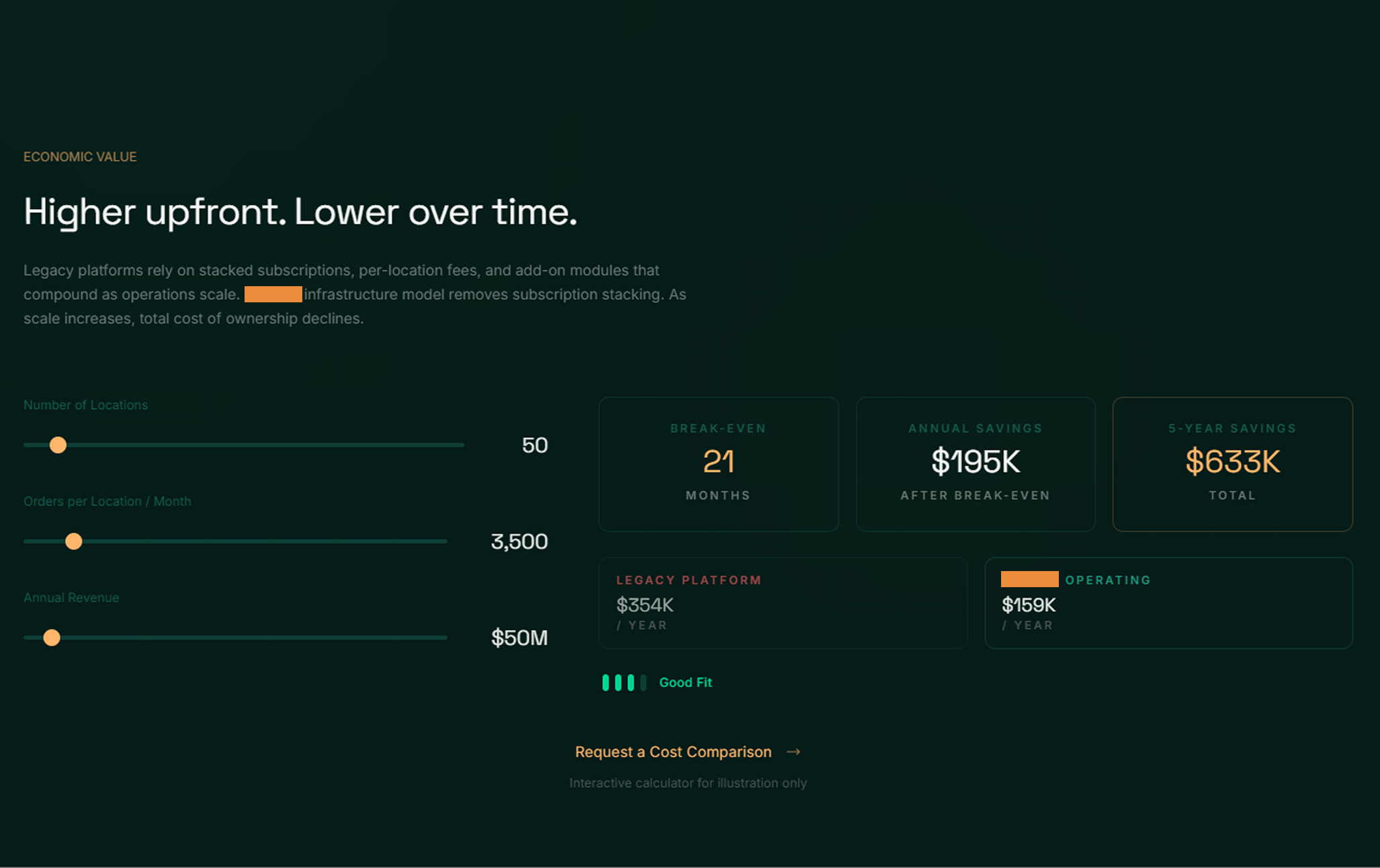
Cost calculator lets prospects model their own economics — turns abstract value prop into personalized evidence.
Since it runs behind experiences, visuals emphasize system architecture and integration flows — not product screenshots.
Six modules presented as interconnected capabilities, not a checkbox feature grid.
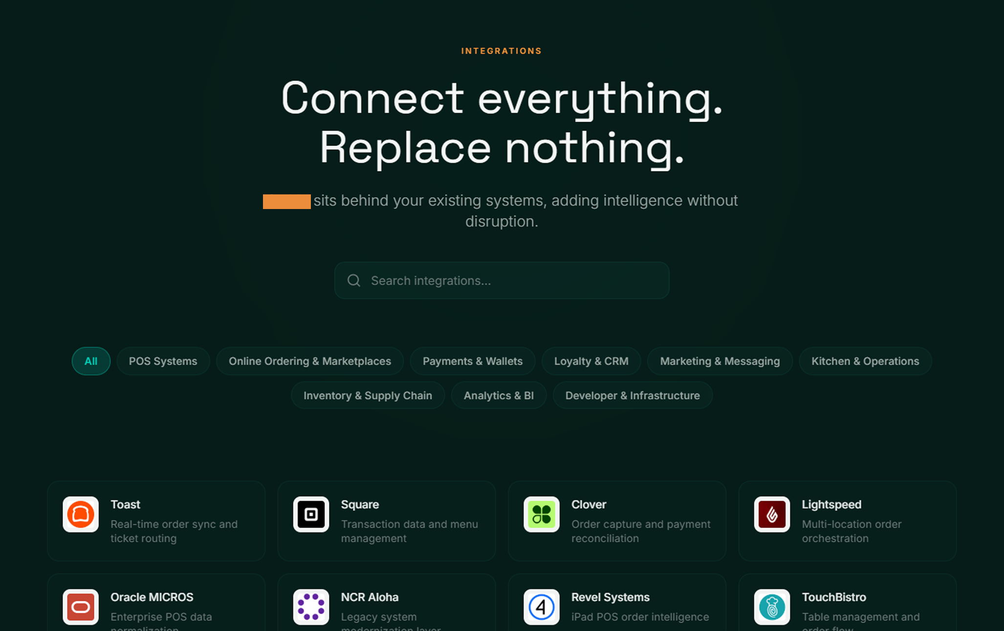
Interactive elements turn abstract value props into personalized evidence. Architecture visuals build technical credibility.
5.2 Discovery Deck
Beyond the marketing site, I designed and built a 21-slide interactive discovery deck — a separate product used for sales conversations. This isn't a PDF. It's a web-based, interactive presentation designed to guide a conversation rather than deliver a monologue.
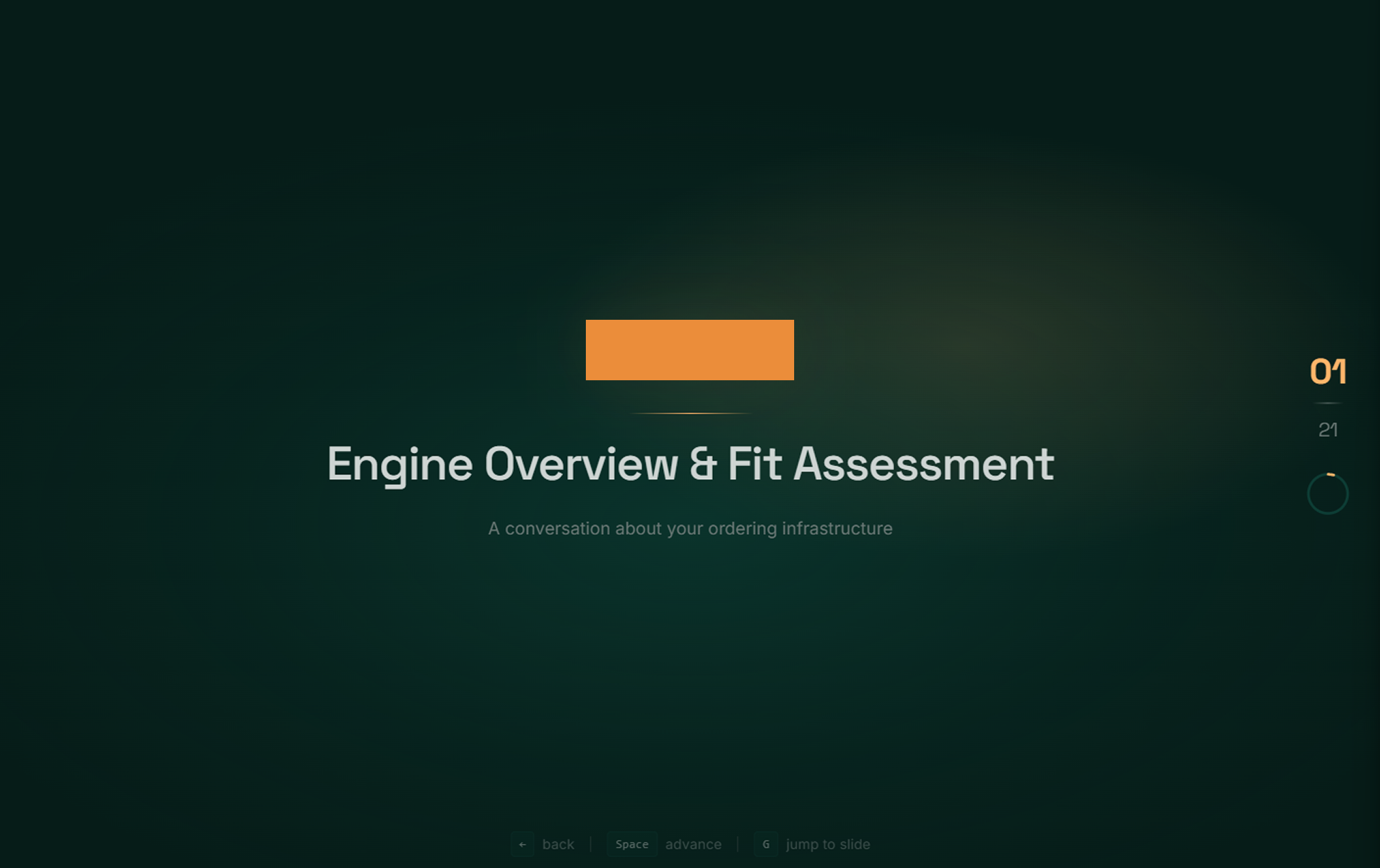
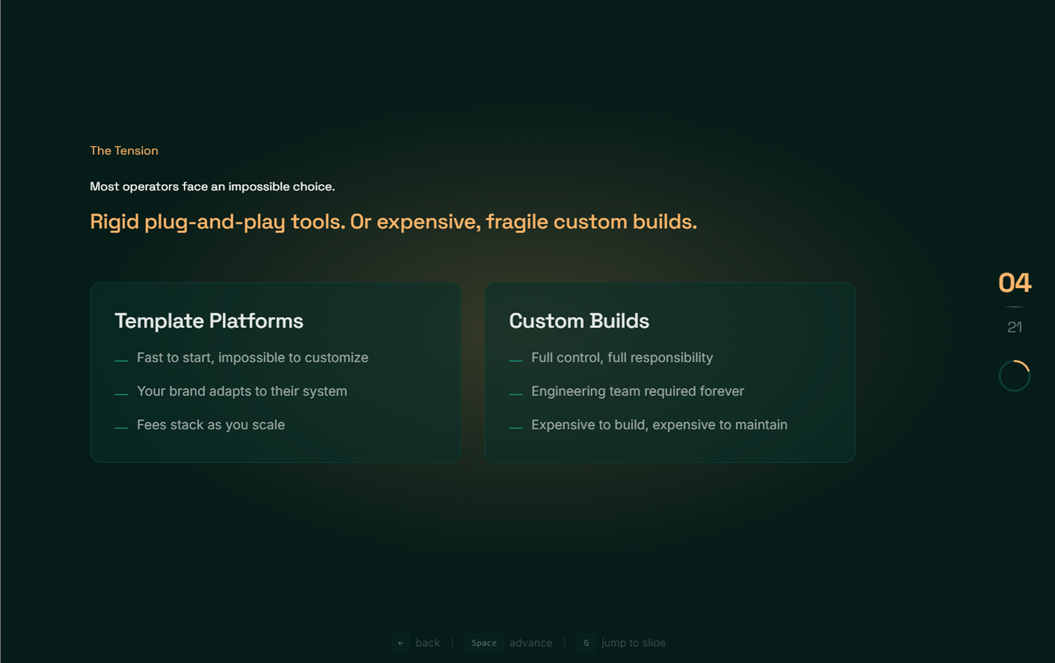
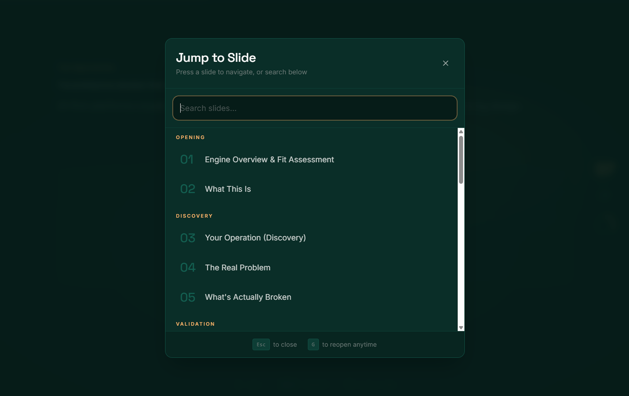
Present the problem before the solution. Make architectural differences legible for non-technical stakeholders.
5.3 Development
I didn't just design this — I built it.
Marketing site in under 2 weeks; discovery deck as a separate deliverable. Production-grade, performance-optimized, SEO-ready, deployed and live.
06
The System I Delivered
This wasn't a single deliverable. It was a go-to-market system — interconnected assets that work together.
The team can extend it — writing new copy, building new pages — without losing consistency.
07
Tradeoffs & Decisions
Infrastructure Positioning vs. Product Positioning
Positioning as a "platform" like competitors — familiar framing, easier to explain.
It would invite direct feature comparison where we'd lose on breadth. Infrastructure positioning creates a different category — you're not choosing between products, you're choosing between renting and owning.
Harder to explain initially. Requires more education. But creates defensible differentiation and justifies premium pricing.
Dark Visual Language vs. Light/Friendly
Lighter, more approachable visual design to reduce intimidation.
Enterprise infrastructure should feel serious. Target buyers are technical and operational leaders who expect depth. Dark palette signals "this is real engineering."
Interactive Discovery Deck vs. Static PDF
Traditional sales deck (PDF/PPT) that's easier to share.
Static decks invite skimming. Interactive format forces engagement, guides conversation, and creates a differentiated sales experience.
Harder to share asynchronously. But enterprise sales are high-touch anyway — designed for live use.
08
Outcome
What I Delivered
13-section governing document defining positioning, voice, language rules
Complete content specs for 10+ pages
Full production site with interactive elements, deployed on Vercel
21-slide interactive sales tool
Both assets built and deployed, production-ready
Business Impact
Market-ready positioning for $500K–$1M enterprise engagements
Sales-ready assets the team can use immediately
Extensible system that maintains consistency without ongoing dependency on me
Timeline
09
Reflection
What Worked
The Brand Constitution as a forcing function
Writing down "what it is and isn't" forced clarity on positioning before any design work began. Every subsequent decision could be checked against it.
Capabilities over features
The language discipline of "what becomes possible" instead of "what we include" elevated the entire messaging layer. It sounds more strategic, feels less commoditized.
The discovery deck as a separate product
Treating the sales tool as its own design problem (not just a subset of the website) made it more effective. It's purpose-built for conversations, not repurposed marketing content.
What I'd Do Differently
More direct user research on the buyer side
Positioning was built from competitive analysis, founder interviews, and domain expertise — but I didn't talk to actual enterprise buyers. In a longer engagement, I'd validate messaging with real prospects.
Earlier alignment on visual direction
The dark palette was the right call, but there was some iteration mid-project. Locking visual language earlier would have saved time.
This project was a full go-to-market build: brand strategy, messaging architecture, UI/UX design, and development.
Delivered in approximately 6 weeks by one person.
From "we can build this" to "we can sell this."
That's the job.
Kantha Bae→
DTC Ecommerce Brand